TL;DR:
- Websites that prioritize performance, accessibility, and brand consistency will stand out more in 2026.
- Choosing a few strategic trends, like dark mode or micro-interactions, ensures better user engagement and measurable success.
The gap between a website that converts and one that merely exists is widening fast. As we move through 2026, the website design trends shaping the web are no longer just aesthetic choices. They are performance decisions, accessibility commitments, and brand signals rolled into one. Whether you are a designer building client sites, a marketer pushing for better engagement, or a business owner wondering why your site feels dated, this guide cuts through the noise and tells you exactly what is worth your attention this year.
Table of Contents
- Key takeaways
- How to evaluate website design trends 2026
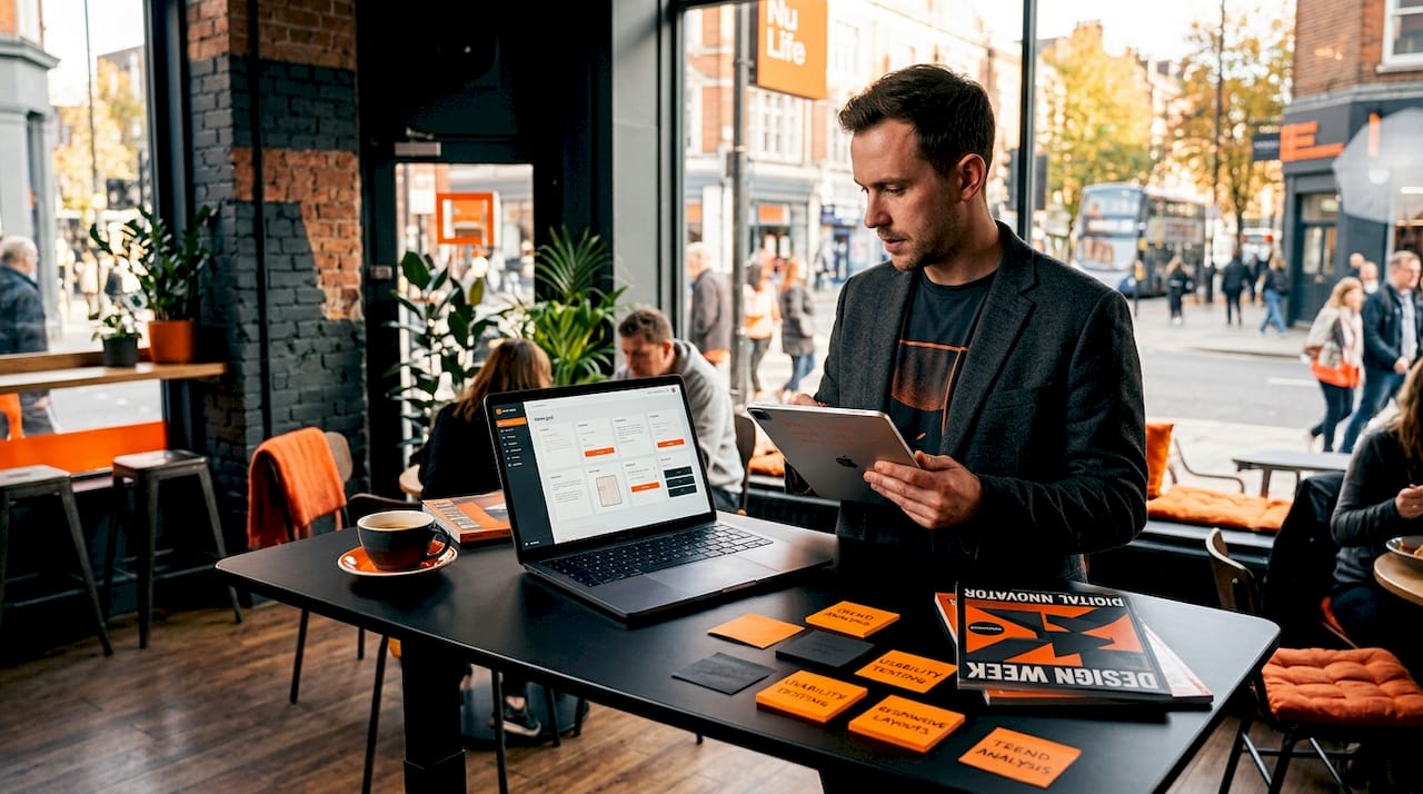
- 1. Bento grid layouts
- 2. Oversized typography as hero
- 3. Kinetic scroll-driven animations
- 4. Dark mode as a design-first strategy
- 5. Claymorphism and 3D softness
- 6. Glassmorphism 2.0
- 7. Brutalism and anti-design
- 8. Micro-interactions as core UX
- 9. AI-generated imagery done right
- 10. Accessible-first colour systems and fluid typography
- Comparing 2026 trends: which to prioritise
- My honest take on chasing 2026 web design trends
- Ready to build a site that converts in 2026?
- FAQ
Key takeaways
| Point | Details |
|---|---|
| Performance is non-negotiable | Every trend you adopt must be tested against Core Web Vitals thresholds before going live. |
| Accessibility drives adoption | WCAG 2.2 compliance is now a baseline expectation, not a bonus feature. |
| Dark mode leads in key sectors | Over half of websites in tech and luxury sectors now design dark mode first. |
| Micro-interactions are standard | Subtle feedback animations have moved from novelty to expected interface behaviour. |
| Trends need a filter | Not every 2026 trend suits every brand. Evaluate by audience, performance, and brand fit. |
How to evaluate website design trends 2026
Before chasing any trend, you need a filter. The web design best practices that drive real results are always grounded in criteria, not aesthetics alone.
Start with performance. Good Core Web Vitals require INP at or below 200ms, LCP at or below 2.5 seconds, and CLS at or below 0.1. Any trend that pushes these into the red is a liability, not an asset.
Then consider:
- Accessibility compliance. WCAG 2.2 sets minimum contrast ratios at 4.5:1 for normal text and 3:1 for large text. Design systems must bake this in from day one, not as a final check.
- Sustainability. The W3C Web Sustainability Guidelines frame sustainability as efficiency, accessibility, and privacy combined. Green hosting alone is not enough.
- Technical feasibility. Browser support, build complexity, and ongoing maintenance all affect whether a trend is viable for your project.
- Brand alignment. A brutalist aesthetic works for a creative agency. It rarely works for a senior care provider.
Pro Tip: Build a one-page trend brief for each project that scores each shortlisted trend against these criteria before a single wireframe is drawn.
1. Bento grid layouts
Bento grid adoption has reached 45% among major web properties, with brands like Apple and Google using them to organise information into modular, scannable panels. The appeal is practical. Bento grids create visual hierarchy without relying on walls of text, and they translate cleanly across screen sizes.
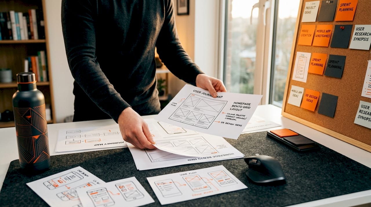
The key to making them work is intentionality. Each panel should serve a distinct purpose. When designers use bento grids as decoration rather than structure, the result feels cluttered rather than considered.
2. Oversized typography as hero
Replacing full-bleed photography with a single bold typographic statement is one of the strongest web design predictions for 2026. It loads faster, communicates brand voice immediately, and scales effortlessly across devices.
The usability risk is legibility at smaller viewports. Fluid typography using CSS clamp() solves this by scaling type relative to the viewport width rather than snapping between fixed sizes. Pair oversized headlines with generous line height and you have a hero section that is both striking and readable.
3. Kinetic scroll-driven animations
CSS scroll-driven animations are now supported in Chrome/Edge 135 and above, and Safari 19 and above, with partial Firefox support. This matters because it means you can build performant scroll-triggered effects without JavaScript, removing a significant source of main-thread congestion.
The trap most teams fall into is overuse. One or two scroll-driven reveals per page adds energy. Six or seven creates cognitive fatigue and, more critically, layout shifts that damage CLS scores.
| Trend | Browser support | Performance risk | Accessibility note |
|---|---|---|---|
| Scroll-driven animations | Chrome/Edge 135+, Safari 19+ | Medium if overused | Use prefers-reduced-motion |
| Bento grids | Universal | Low | Logical reading order required |
| Oversized typography | Universal | Low | Viewport scaling needed |
Pro Tip: Always include a prefers-reduced-motion media query that disables or simplifies animations for users who have set this preference in their operating system.
4. Dark mode as a design-first strategy
Dark mode is now mainstream at 55% adoption across tech and luxury sectors. The shift in 2026 is that leading teams are designing in dark mode first, then adapting to light, rather than treating it as an afterthought toggle.
The performance case is real. Dark backgrounds on OLED screens reduce pixel illumination, which lowers battery consumption on mobile devices. The aesthetic case is equally strong. Saturated accent colours pop against dark backgrounds in ways that feel premium and deliberate.
The accessibility case requires more care. WCAG 2.2 compliance in dark mode must cover all interactive states, including hover, focus, and disabled, not just body text contrast. Semi-transparent overlays and glassmorphic layers can silently break contrast ratios in specific states.
Pro Tip: Run your dark mode design through a contrast checker at every interactive state, not just at rest. Focus states are the most commonly overlooked failure point.
5. Claymorphism and 3D softness
Claymorphism uses inflated, soft-edged 3D shapes with subtle inner shadows to create a tactile, approachable visual language. It sits at the opposite end of the spectrum from sharp brutalism, and it performs particularly well for consumer apps, children’s platforms, and lifestyle brands.
The technical consideration is render cost. Complex 3D CSS or WebGL elements can affect INP if they trigger expensive repaints. Keep claymorphic elements as static or CSS-only where possible, and reserve WebGL for moments where the interaction genuinely justifies the overhead.
6. Glassmorphism 2.0
The original glassmorphism trend leaned heavily on backdrop blur and translucency. The 2026 iteration adds layered depth, using multiple translucent panels at different z-levels to create genuine visual hierarchy rather than surface decoration.
Used well, it communicates sophistication and modernity. Used poorly, it creates illegible interfaces where text floats over unpredictable backgrounds. The rule is simple: if the background behind a glass panel can change dynamically, you must test contrast at every possible state.
7. Brutalism and anti-design
Brutalism is having a second moment, and the reason is cultural rather than aesthetic. As AI-generated design floods the web with polished sameness, deliberately raw, asymmetric, and typographically aggressive sites stand out as authentically human.
This is not a trend to adopt lightly. Brutalism works when it is a genuine expression of brand personality. When it is adopted as a style exercise, audiences read it as confusion rather than confidence. The brands pulling it off in 2026 are those whose entire identity is built around individuality.
8. Micro-interactions as core UX
Micro-interactions have moved from novelty to necessity. A button that scales slightly on hover, a form field that validates inline, a menu that opens with a smooth ease. These signals tell users the interface is alive and responsive.
The performance constraint is real. Animations that trigger layout recalculations push up INP scores. Stick to CSS transitions on properties that do not trigger reflow, specifically transform and opacity, and you get the engagement benefit without the performance cost.
- Use transform and opacity for all motion effects
- Validate form inputs inline rather than on submission
- Keep animation durations between 150ms and 300ms for natural feel
- Test on mid-range Android devices, not just flagship hardware
9. AI-generated imagery done right
AI-generated imagery in 2026 is indistinguishable from photography in many contexts. Tools like Midjourney, Adobe Firefly, and DALL-E are now routine in professional design workflows. The opportunity is real. Custom, on-brand visuals without a photo shoot budget.
The ethical and brand risk is equally real. AI images can carry subtle visual artefacts that erode trust on closer inspection. They can also homogenise brand identity if teams pull from the same aesthetic prompts as everyone else. Use AI imagery as a starting point, then refine with brand-specific direction, colour grading, and context.
10. Accessible-first colour systems and fluid typography
This is the trend with the highest return on investment and the lowest glamour. Building your colour system around WCAG 2.2 contrast requirements from the start, rather than retrofitting compliance at the end, saves significant rework and protects you from legal exposure in markets where accessibility is a regulatory requirement.
Fluid typography compounds the benefit. Using CSS clamp() to scale type fluidly between a minimum and maximum size means your content reads well on a 320px mobile screen and a 2560px desktop monitor without a single media query breakpoint.
Pro Tip: Define your colour tokens in a design system with contrast ratios documented alongside each pairing. This makes dark mode adaptation and future rebrands dramatically faster.
| Approach | Effort | Compliance benefit | Performance impact |
|---|---|---|---|
| Fixed colour palette | Low | Risk of failures | None |
| Accessible-first colour system | Medium | WCAG 2.2 met by default | None |
| Fluid typography | Low | Readability across devices | Positive |
| Fixed breakpoint typography | Low | Inconsistent | Neutral |
Comparing 2026 trends: which to prioritise
Not every trend belongs on every project. Here is a practical lens for matching trends to contexts.
Marketing and lead generation sites benefit most from oversized typography, bento grids, and micro-interactions. These improve clarity, hierarchy, and conversion without adding significant technical complexity. Pairing strong design with essential conversion elements is what separates a good-looking site from one that actually performs.
E-commerce brands should prioritise micro-interactions, accessible colour systems, and dark mode support. Fluid typography reduces friction across device types, which matters when a significant share of purchases happen on mobile. The 2026 digital marketing trends driving e-commerce growth all point toward faster, cleaner, more responsive experiences.
Portfolio and creative agencies have the most latitude. Brutalism, claymorphism, and kinetic scroll animations are all viable when they serve the brand narrative.
The common mistake across all categories is adopting trends in isolation. A glassmorphic hero section sitting on a site with poor Core Web Vitals scores and no dark mode support is not a design upgrade. It is a contradiction.
Web sustainability is also worth treating as a design constraint rather than a nice-to-have. Optimising at the code, asset, and user journey level delivers performance gains and sustainability gains simultaneously.
My honest take on chasing 2026 web design trends
I’ve watched a lot of businesses invest heavily in trend-led redesigns and come away disappointed. Not because the trends were wrong, but because the brief was wrong. The question was “what looks modern in 2026” when it should have been “what serves our users and converts our traffic.”
The teams getting the most out of these trends are the ones treating performance budgets as a creative constraint from day one. When you know your LCP target is 2.5 seconds, it changes which animations you commission and which visuals you choose. That constraint produces better design, not worse.
Accessibility is the other area where I see shortcuts taken that cost far more to fix later. Contrast ratio as a design constraint built into your token system from the start is a ten-minute decision that saves days of remediation work.
My advice: pick two or three trends that genuinely align with your brand and your users. Execute them with precision. A site that does three things brilliantly will outperform one that attempts ten things adequately every single time.
— Ryan
Ready to build a site that converts in 2026?
Understanding the trends is one thing. Translating them into a site that generates real enquiries and revenue is another challenge entirely. At Nulifedigital, we design and build websites engineered around performance, accessibility, and conversion from the ground up. Whether you are starting from scratch or rethinking an existing site, our high-converting website checklist is a practical starting point. For businesses ready to go further, our AI integration services bring intelligent automation into the mix to turn your site into a growth engine.
FAQ
What are the top website design trends for 2026?
The leading trends include bento grid layouts, dark mode design, scroll-driven animations, micro-interactions, and accessible-first colour systems. Each trend is gaining traction because it improves both user experience and measurable performance.
How do Core Web Vitals affect design choices in 2026?
Core Web Vitals set performance thresholds that design decisions must respect. Good INP requires animations to avoid main-thread blocking, and good CLS requires stable layouts, meaning visual trends must be implemented with performance budgets in mind.
Is dark mode now a design requirement?
Dark mode has reached 55% adoption in tech and luxury sectors and is increasingly treated as a primary design mode rather than an optional toggle. WCAG 2.2 compliance must be validated across all interactive states in dark themes, not just body text.
What is accessible-first colour design?
It means building your colour system around WCAG 2.2 contrast requirements from the start of a project. The minimum ratio is 4.5:1 for normal text and 3:1 for large text, with enhanced targets of 7:1 and 4.5:1 for higher compliance levels.
Should every business adopt all 2026 web design trends?
No. The most effective approach is selecting two or three trends that align with your brand identity, audience expectations, and technical capacity. Executing a small number of trends with precision delivers better results than adopting every trend superficially.