
TL;DR:
- Most businesses underestimate the importance of mobile optimisation, risking lost customers and rankings.
- Mobile-first design improves load speed, user trust, and SEO performance, leading to higher conversions.
Most business owners assume their website works on mobile because it “looks fine” on their phone. That assumption is costing them customers. Mobile devices generated nearly 65% of total web traffic as of mid-2025, yet the majority of websites still treat mobile as an afterthought. Why mobile optimisation matters goes far beyond shrinking a desktop layout to fit a smaller screen. It shapes your search rankings, your conversion rates, and whether first-time visitors trust you enough to take the next step.
Table of Contents
- Key takeaways
- What mobile optimisation actually means
- The business case: SEO, engagement, and conversions
- Practical techniques that make a real difference
- Responsive design vs mobile-first: which suits your business
- Embedding mobile into your marketing strategy
- My take on where most businesses go wrong
- Ready to turn your mobile site into a growth engine?
- FAQ
Key takeaways
| Point | Details |
|---|---|
| Mobile traffic dominates | Nearly two-thirds of all web traffic is mobile, making a strong mobile experience non-negotiable. |
| Google indexes mobile first | Your mobile site is what Google primarily uses to rank you, so poor mobile performance harms SEO directly. |
| Speed drives conversions | Sites loading in one second convert up to three times more visitors than those taking five seconds. |
| Mobile-first beats responsive | Starting design at the smallest screen produces faster, more focused sites than scaling desktops down. |
| Analytics reveal the truth | Device-level behaviour data uncovers where mobile users drop off and where revenue is being left behind. |
What mobile optimisation actually means
There is a widespread confusion between making a site “responsive” and truly optimising it for mobile. Responsive design means your layout adjusts to different screen sizes. Mobile optimisation means you have designed the entire experience with mobile users as the primary audience, from layout decisions to load time to the way someone taps a button with their thumb.
Mobile-first design starts at the smallest screen, validating every layout decision at a 375px viewport before scaling up. Desktop-first sites do the opposite. They load everything a desktop needs and then try to compress it into a mobile window. The result is predictable: bloated pages, tiny tap targets, and navigation menus that were clearly never intended for a thumb.
The difference matters more than most people realise. Desktop-first design routinely leads to hidden content, poor performance, and compromised experiences that frustrate users and hurt rankings. Consider a retail brand that had a beautifully designed desktop homepage. On mobile, the product categories were buried under a collapsed menu that required three taps to reach. They assumed the layout was “fine” because nothing was technically broken. Their mobile bounce rate told a different story.
Here is what separates genuine mobile optimisation from a surface-level responsive tweak:
- Touch target sizing: Tap targets must be at least 44×44 pixels with adequate spacing. Hover states from desktop interfaces do not translate to touchscreens.
- Navigation built for thumbs: Primary actions should sit within the natural reach zone of a thumb holding a phone. Bottom navigation bars outperform top-heavy menus on mobile.
- Content parity: Content hidden in default-closed accordions or simply omitted on mobile versions harms SEO rankings because Google reads the mobile version first.
- Performance as a constraint: Mobile-first thinking treats page weight and load time as hard limits before a single line of code is written, not as metrics to fix later.
Pro Tip: Check your mobile site on a real device using your phone’s 4G connection, not your office Wi-Fi. The performance difference will likely surprise you.
| Approach | Starting point | Performance | SEO impact |
|---|---|---|---|
| Desktop-first responsive | Large screen layout | Often slower on mobile | Risk of content mismatch |
| Mobile-first design | Smallest screen | Faster, leaner | Full content parity |
The business case: SEO, engagement, and conversions
Understanding why mobile optimisation matters is straightforward once you look at where the business costs actually land.
Search rankings. Google’s mobile-first indexing means Google primarily uses your mobile version to determine where you rank. If your mobile site hides content that appears on desktop, or loads slowly, your rankings suffer regardless of how good the desktop experience is. This is not a future concern. It has been standard Google practice since 2019 and the implications compound over time.
Conversion rates. The data here is stark. Sites loading in one second convert up to three times more visitors than sites taking five seconds. On mobile, where users are more likely to be in transit or browsing with limited patience, slow load times translate directly into abandoned sessions and lost sales. A form that is difficult to complete on a small screen, a call-to-action button that is hard to tap, or a checkout flow designed for a mouse cursor: each one bleeds revenue you will never see recorded anywhere.
User trust and engagement. Poor mobile experience communicates something to your visitor before they have even read a word. It signals that you have not thought about them. That impression is hard to recover from. Visitors who find forms easy to fill in, buttons easy to tap, and content easy to scan are far more likely to complete an enquiry or a purchase.
The practical touchpoints where mobile optimisation directly improves outcomes include:
- Call-to-action buttons that are immediately visible without scrolling
- Phone number links that trigger a call with a single tap
- Forms with appropriately sized input fields and mobile-friendly keyboards
- Checkout flows with minimal steps and auto-fill support
- Page speeds that do not punish users on slower networks
Pro Tip: Use Google’s PageSpeed Insights and run it separately for mobile and desktop. The mobile score is the one that matters most for both UX and search ranking performance.
Mobile optimisation for SEO and conversions are not separate initiatives. They feed each other. Faster load times improve rankings, which bring more mobile traffic, which converts better when the experience is designed for that context. Improving your mobile website performance is one of the highest-return investments a business can make.

Practical techniques that make a real difference
Knowing why mobile optimisation matters is only half the job. Here is where to focus your effort.
-
Compress and modernise your images. Uncompressed images are the single most common cause of poor mobile PageSpeed scores. Convert images to WebP or AVIF formats and use lazy loading so images only load when they scroll into view. A hero image that is fine at 2MB on a desktop becomes a 3-second delay on mobile.
-
Audit your navigation for thumb use. Menus that work brilliantly on desktop often require awkward stretches or accidental taps on mobile. Test your navigation on a physical phone, not a browser developer tool, and restructure it around the most common tasks your mobile users actually perform.
-
Test on real devices and real networks. Simulators miss issues that only appear on actual hardware under real network conditions. Borrow a range of Android and iOS devices. Test on 4G and 3G. What you find will be different from what any emulator shows you.
-
Set a performance budget before you build. Mobile-first design treats performance as a core constraint, establishing limits for page weight and load time before development begins. If you are working on an existing site, set a target, measure against it, and hold the line with every update.
-
Use heatmaps and session recordings for mobile separately. Desktop heatmaps tell you very little about mobile behaviour. Tools that record mobile sessions reveal which elements users tap, where they stall, and where they give up. This data is far more useful than guessing.
-
Verify schema markup on mobile. Structured data must be present and accurate on your mobile version. If your schema is only applied to desktop templates, you are leaving rich snippet opportunities on the table.
Pro Tip: Segment your analytics by device type as a permanent practice. Mobile users typically show different behaviour patterns, different drop-off points, and different peak usage hours compared to desktop users. Treating them as a single audience means missing the real story.
Responsive design vs mobile-first: which suits your business
The choice between responsive design and a mobile-first approach is not purely technical. It depends on who your audience is and what they need to accomplish.
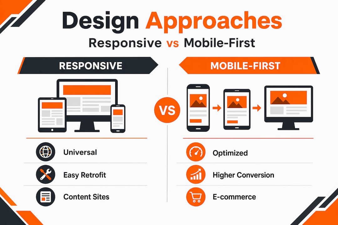
Responsive design offers universal compatibility and is faster to implement on existing sites. It works well for content-heavy platforms where desktop users represent the majority, such as B2B software tools, data reporting dashboards, or internal portals. The drawback is that mobile-first design produces cleaner, faster, more focused sites by forcing you to prioritise critical content and simplify navigation from the outset.
For e-commerce brands, service businesses, hospitality companies, and anyone whose audience predominantly browses on a phone, mobile-first is the stronger choice. The constraint of designing at 375px forces decisions that make your site better overall, not just on small screens.
| Business type | Recommended approach | Primary reason |
|---|---|---|
| E-commerce and retail | Mobile-first | Majority of browsing and purchases on mobile |
| B2B software or SaaS | Responsive | Desktop-dominant user base |
| Hospitality and experiences | Mobile-first | High in-the-moment mobile intent |
| Internal tools and dashboards | Responsive | Complex data layouts suited to larger screens |
Check your audience behaviour before committing. If more than 55% of your sessions come from mobile, mobile-first is not optional. If you are building for higher e-commerce conversions, mobile-first is almost certainly the right architecture.
Embedding mobile into your marketing strategy
Mobile optimisation is not a one-time project. It is an ongoing responsibility that touches every part of your digital marketing effort.
The most effective businesses treat it as a permanent practice rather than a launch checklist item. That means:
- Running quarterly mobile performance audits against your PageSpeed and Core Web Vitals benchmarks
- Reviewing device-level analytics every month to spot new drop-off points as content and campaigns change
- Aligning your SEO, UX, and conversion goals around mobile performance metrics, not just desktop figures
- Briefing content teams to write for mobile reading patterns, which favour shorter paragraphs, clear headers, and immediate answers
- Planning for emerging devices and UI patterns such as foldable screens, voice browsing, and progressive web apps
Teams that focus on analytics, performance budgets, and cross-functional collaboration consistently outperform competitors who treat mobile as a separate concern. The most common gap is not technical. It is organisational: marketing, design, and development teams working in silos, each optimising for their own metric without a shared standard for mobile quality.
Integrating mobile into your broader digital strategy means setting shared KPIs that reflect mobile user behaviour, not just overall site metrics. Bounce rate by device, conversion rate by device, and average session duration by device should all be visible to every team member who influences the site.
My take on where most businesses go wrong
From what I have seen working across dozens of business websites, the most common and costly mistake is not a technical one. It is a mindset one. Teams treat mobile as the version they will “sort out” after the desktop site is polished. By then, budget is thin, deadlines are pressing, and mobile gets a quick squeeze-down rather than a genuine design.
The second issue I encounter constantly is over-reliance on browser developer tools for testing. Emulators feel convenient but they genuinely lie to you. I have personally seen sites that passed every emulator test and fell apart on an actual Android device on a standard network connection. Real-device testing is not optional if you are serious about mobile site performance.
The third thing is brand ego. Businesses with premium branding sometimes resist performance constraints because they want large, high-resolution imagery and elaborate animations. Those priorities are understandable, but the user who bounces after two seconds on a 4G connection has not been impressed. They have simply left. The impact of mobile optimisation on your bottom line is not theoretical. It shows up in the revenue you do not earn and the enquiries that never arrive.
The businesses I see winning on mobile are the ones that treat it as their primary channel, not their backup plan.
— Ryan
Ready to turn your mobile site into a growth engine?
If your analytics show visitors landing on mobile and leaving without converting, the problem is usually fixable and the upside is immediate.

At Nulifedigital, we build and optimise websites that are engineered to perform where your audience actually is. Our mobile-first web design approach means every site we produce loads fast, converts well, and ranks strongly. Whether you are running an e-commerce brand, a service business, or a premium experience offering, we audit your current mobile performance and build a clear path to better results. We also offer e-commerce growth services for brands ready to scale online revenue with smarter mobile experiences.
Talk to us about what your mobile site is currently costing you.
FAQ
Why does mobile optimisation matter for SEO?
Google uses mobile-first indexing, meaning it primarily crawls and ranks your mobile version. If your mobile site hides content or loads slowly, your rankings drop regardless of how well your desktop site performs.
What is the difference between responsive design and mobile-first design?
Responsive design adapts a desktop layout to smaller screens. Mobile-first design starts with the smallest screen and builds up, producing faster and more focused experiences that typically convert better on mobile devices.
How does page speed affect mobile conversions?
Sites loading in one second convert up to three times more visitors than sites taking five seconds to load. On mobile, where user patience is shorter, speed is directly tied to revenue.
How do I know if my mobile site needs improvement?
Segment your analytics by device type and compare mobile bounce rate and conversion rate against desktop. A significantly worse mobile performance signals problems with speed, usability, or content accessibility on smaller screens.
Can I test my mobile site without specialist tools?
You can begin by opening your site on a real phone using a 4G connection rather than Wi-Fi. Testing on actual devices reveals issues that browser emulators routinely miss, including rendering differences and real-world load time problems.